

Jan 29
Mobile Side Bar UI Feedback
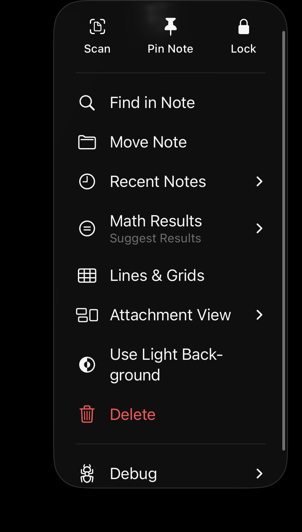
Instead of the Side Bar, maybe pressing that button would bring down a menu like the picture below with all the options, just to keep the liquid glass consistent. The Order could be Workspace, Merchants, Institutions, Rules, and Settings. When clicked they would each bring up a page like the current settings, how it comes up from the Bottom.
Reviewing
This is how I had it originally, but then I realized I'm going to keep adding new features. This list is going to be pretty long for a context menu drop-down like this, and that's why I added the sidebar. I think it's also a little bit quicker to swipe from the left, than to reach your finger all the way up to the top left of the phone to click it. However, I'm completely open to changing this if this gets some votes on it. I think you and I may agree that prioritizing this a little bit lower is the right move, at least for now.